
Wedding colours to save and use
Wedding colour palettes, with a place for every shade.
Choose a light base, one colour to lead and a few smaller accents. These three original moodboards show how that can work across flowers, linen, ribbons and paper, with colour references and a short styling brief to adapt.
How do you turn a wedding colour palette into a styling plan?
Choose a light base for the larger surfaces, a main colour to lead and a few smaller accents. Give each shade a place in your flowers, linen, ribbons or paper. Use screen colours as starting references, compare physical samples in your venue’s light and share one agreed brief with your suppliers.
The moodboards are AI-created styling illustrations, rather than photographs of real client weddings or a catalogue of products for sale. The hex codes are digital starting points: compare actual fabric, flowers and printed samples before confirming your choices.
Terracotta & Cream
A warm courtyard wedding
Build a warm, earthy scheme with a light ivory base, terracotta textiles and small apricot touches. Olive foliage and cocoa details give the softer shades a darker companion.
- Warm Ivory
#F5EFE5 - Terracotta
#BC7057 - Apricot
#E8B69B - Olive Leaf
#838A64 - Cocoa
#6C5045
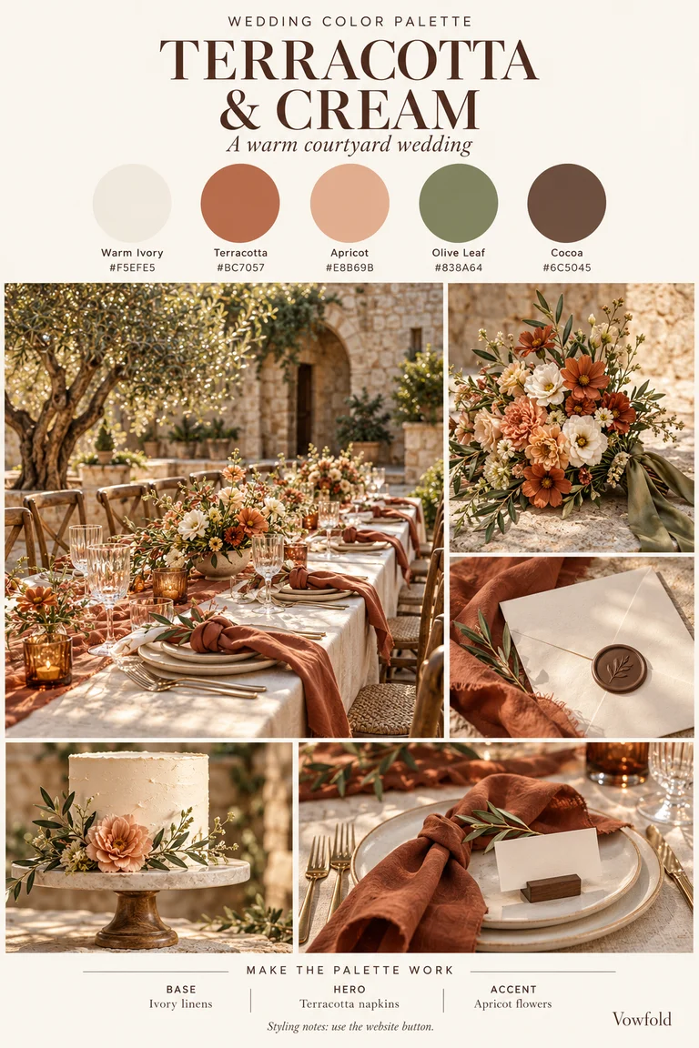
Make the palette work
Base
Ivory linens
Start with the largest light surfaces: the tablecloth, plates and paper. Keep this base visible between the stronger colours.
Hero
Terracotta napkins
Choose one main terracotta detail, such as a napkin at every place. Compare the fabric sample with the venue’s existing stone, timber or flooring.
Accent
Apricot flowers
Ask your florist to interpret the peach-to-apricot colour direction. Olive foliage and a small cocoa detail can complete the scheme without adding another bright colour.
Where each shade can go
- Warm Ivory: Tablecloths, plates and light paper backgrounds.
- Terracotta: Napkins or one statement textile.
- Apricot: Flower accents and a small cake detail.
- Olive Leaf: Foliage or a narrow ribbon.
- Cocoa: Dark lettering, place-card holders or a wax seal.
A styling brief to borrow
We are planning a warm ivory and terracotta wedding, with apricot flower accents, olive foliage and small cocoa details. Ivory is the base, terracotta is the main textile colour, and apricot is the softer accent. Please suggest available materials and flowers, and show us physical samples before we confirm.
Adapt the brief to the things you are actually using. The flower varieties, rentals, stationery and fabrics shown in the illustration are examples; agree the specific items and quantities with your suppliers.
Lavender & Sage
A soft garden celebration
Use lavender flowers and sage ribbons around a warm ivory base. Soft lilac adds a second gentle purple, while deep olive gives lettering and small details a clear darker shade.
- Lavender
#B7A4CF - Sage
#A3B19A - Warm Ivory
#F7F2EA - Soft Lilac
#D9CCE7 - Deep Olive
#59654E
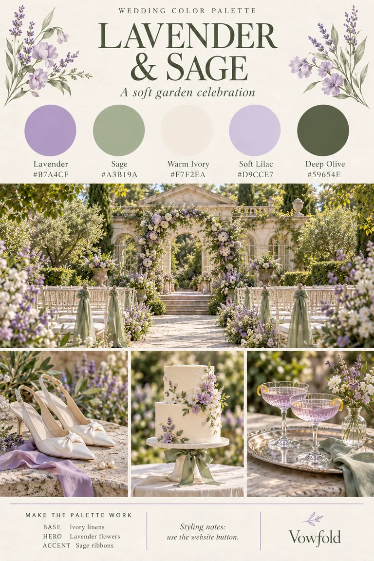
Make the palette work
Base
Ivory linens
Let the tablecloth, plates and paper provide a light shared background. Compare the different ivory materials together before buying the full quantities.
Hero
Lavender flowers
Keep lavender as the main colour in your floral brief. Ask the florist which flowers and softer lilac tones can create that effect for your date and location.
Accent
Sage ribbons
Repeat sage in a ribbon or napkin, then use deep olive for a small dark detail. A single sample place setting will help you choose the balance you prefer.
Where each shade can go
- Lavender: The main flower colour or one statement textile.
- Sage: Ribbons, napkins or other repeated fabric details.
- Warm Ivory: Tablecloths, plates and light paper backgrounds.
- Soft Lilac: A lighter supporting flower or fabric accent.
- Deep Olive: Dark lettering and small finishing details.
A styling brief to borrow
We are planning a warm ivory garden wedding with lavender flowers, sage ribbons and soft lilac supporting accents. Deep olive is our dark detail colour. Please suggest available flowers and materials, and show us a sample combination in the venue’s light before we confirm.
Adapt the brief to the things you are actually using. The flower varieties, rentals, stationery and fabrics shown in the illustration are examples; agree the specific items and quantities with your suppliers.
Olive & Champagne
A warm, candlelit celebration
Give a warm ivory base a richer companion with olive napkins and champagne ribbons. Espresso adds depth to small details, while soft gold can repeat in a pen, holder or candle fitting.
- Warm Ivory
#F6F0E5 - Champagne
#D8C3A5 - Olive
#71744B - Espresso
#493B32 - Soft Gold
#B79B62
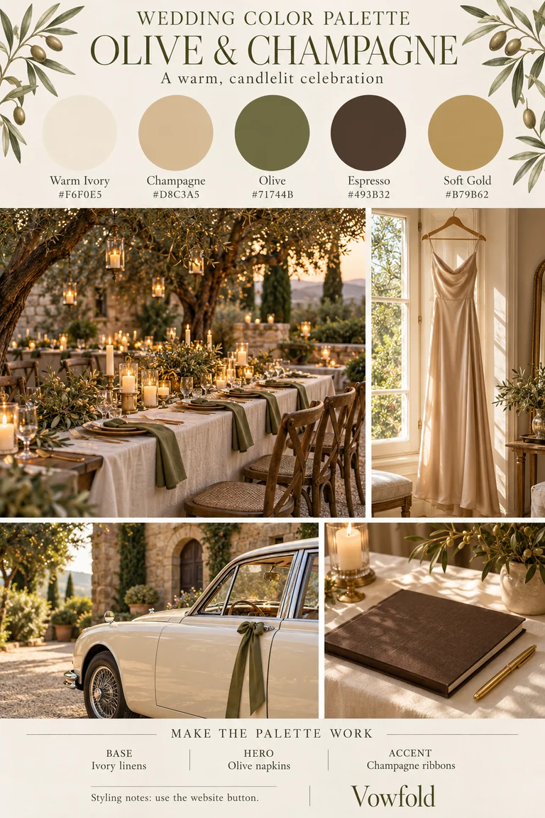
Make the palette work
Base
Ivory linens
Keep the tablecloth and other large surfaces light so that olive remains distinct in evening light. Compare your chosen ivory fabric with the venue’s existing colours.
Hero
Olive napkins
Repeat the main olive tone in napkins or one other textile. View a real sample beside your plates and champagne fabric, in daylight and in lighting similar to your dinner.
Accent
Champagne ribbons
Use champagne for a softer satin accent. Add espresso and soft gold sparingly in a guestbook or small accessories; a metal finish will reflect light differently from a flat screen swatch.
Where each shade can go
- Warm Ivory: Tablecloths, light paper and other large background surfaces.
- Champagne: Satin ribbons or a supporting textile.
- Olive: Napkins and a few repeated fabric details.
- Espresso: A guestbook cover, lettering or small dark holders.
- Soft Gold: Small metal details such as a pen or candle fittings.
A styling brief to borrow
We are planning a warm ivory wedding with olive napkins and champagne satin accents. Espresso is our small dark detail, with restrained soft-gold metal touches. Please show us available fabrics and finishes together, including in lighting similar to our reception, before we confirm quantities.
Adapt the brief to the things you are actually using. The flower varieties, rentals, stationery and fabrics shown in the illustration are examples; agree the specific items and quantities with your suppliers.
Make the colours work in your venue
- Start with the room. Look at the existing walls, flooring, furniture and surroundings. Choose which of those colours you want your palette to sit beside.
- Give each colour a job. Decide what forms the light background, which shade leads and where the smaller accents repeat. You can leave a shade out if it adds another purchase without helping the look.
- Compare one small set. Put a napkin, a piece of paper, a ribbon and your flower references together. Ask to see the combination in daylight and in lighting similar to your reception.
- Agree the physical samples. Use the hex codes to describe the direction on a screen. Ask fabric and print suppliers for their own samples or proof; a screen code does not guarantee an exact match across different materials.
- Share one final version. Send the same chosen palette and agreed sample notes to the people arranging the flowers, tables and paper. Keep your base, hero and accent choices explicit.
Bring the palette into your paper details
Use a ribbon, envelope, holder or surrounding table linen to connect your paper details with the rest of the wedding. For sign wording, start with six complete examples to borrow, then check a printed sample for readability.
A wedding newspaper can sit within the same table setting and carry your story, confirmed timings and a guest activity. Vowfold’s newspaper fonts, colours and layout are designed for you; these moodboard shades are inspiration for styling around the paper, rather than custom colour settings in the editor.
See the actual newspaper design or choose useful content for its four pages. Physical printing and styling items are arranged separately.